EVERYTHING WE DO IS HANDLED AS ART
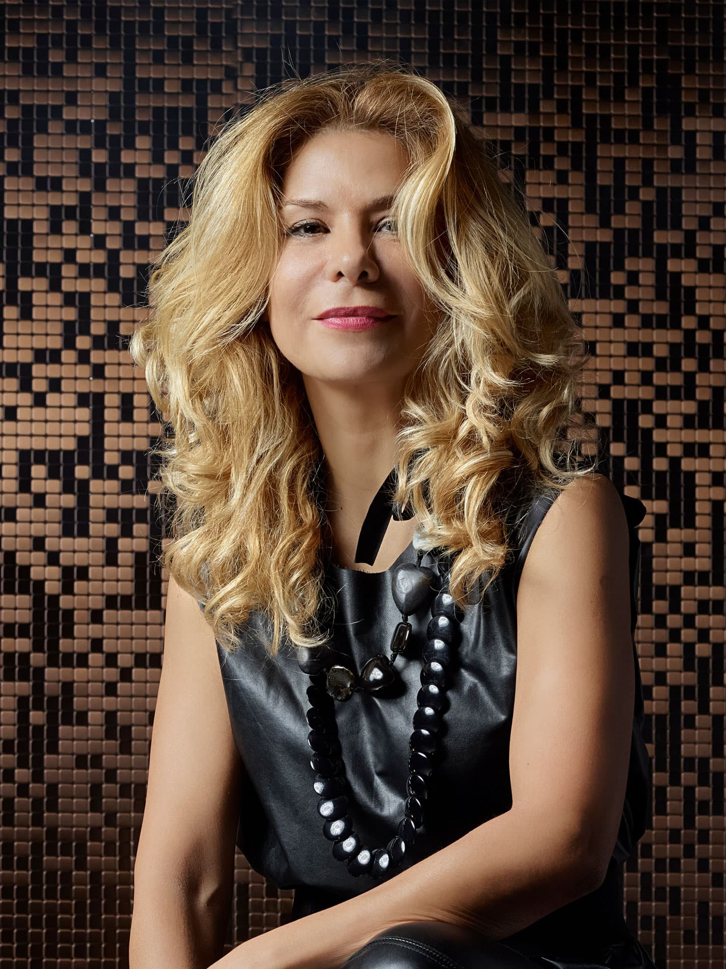
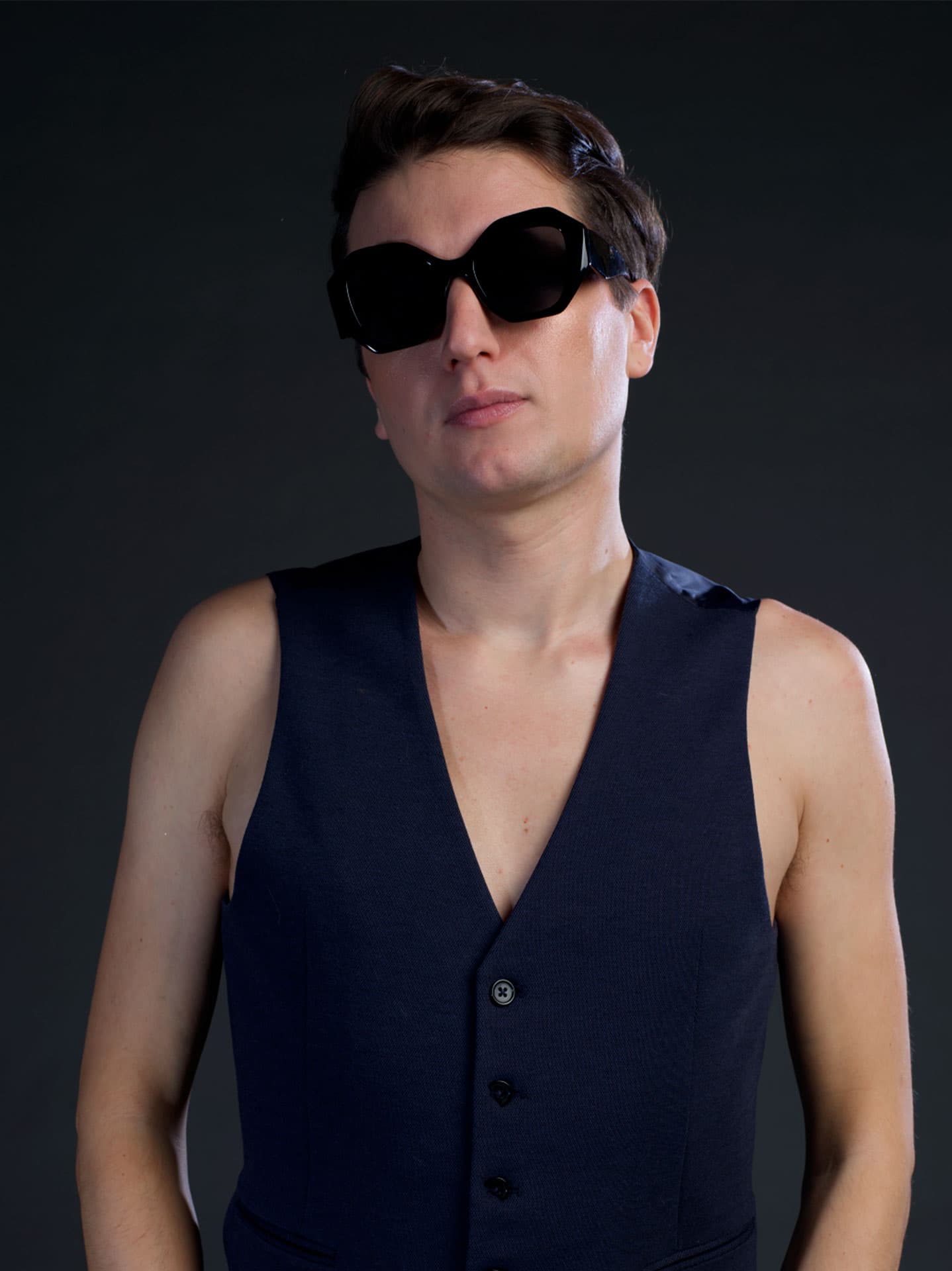
Factory of Art emerged from the dynamic collaboration between photographer Monica Silva and designer Valerio Fausti. Their mission is clear: to transcend the limitations of their respective fields and create a "forge of freedom." Driven by a passion for uncovering hidden beauty, they push beyond the obvious, exploring deeper and thinking outside the box. Their innovative approach is fresh, unexpected, and captivating. Every project is meticulously crafted, where nothing is left to chance, yet free from rigid constraints. This allows them to express a vibrant and transformative vision that challenges conventions and inspires awe.
DESIGNING FOR BEAUTY
ARTING FOR LOVE
The silhouette created by the horizontal arms of the letter F evokes the smokestacks of a factory, drawing a deliberate and obvious parallel to Andy Warhol’s Factory. Both Factory of Art and Warhol’s Factory share a common setting: repurposed industrial spaces. But the similarities run deeper. They both explore the potential of language through innovative media, grounded in a vision of reality as an aesthetic construct that fosters the interconnection between art, industry, and other human expressions.
THE FACTORY
AN ANDY WARHOL TRIBUTE
A PICTOGRAM DESIGNED TO EMBODY AN ENTIRE CREATIVE PROCESS
Our pictogram represents the synthesis of our creative process. From the curious, attentive and profound observation of things to the creation of new worlds, passing through the stages of research and the overturning of reality, the change of point of view.
MORE THAN CREATIVE
OUR SHAPES
SQUARE AND CIRCLE
The circle that protrudes from the square is an eye and symbolizes looking at things. The part on the outside of the square is the cornea, the first lens to encounter light, placed in front of the pupil, the open door to the outside world from which the internal process that enables the perception and formation of images begins, starting with the light impulses passed through the lens of the crystalline lens and then focused on the retina and sent via the optic nerve to the brain, which processes them and returns the image by orienting it in the “right direction.” The diameter of the pupil varies with the intensity of the light, but it is also influenced by emotions, moods and thoughts; it is the aperture open to the world and this connects it directly to the camera whose operation reproduces in its intent at its most basic state that of the human eye. With the substantial difference that in this case the 'inversion of the incoming image from the lens system is then straightened by the sensor. From a conceptual point of view, the Factory of Art logo represents in the first instance an invitation to a change of point of view, of looking at things, to a reversal of reality, a concept that is fully realized in the word ART, the soul of the Factory.
Through the reversal of reality and a new look at things, Factory thus arrives at the creation of a new world, hence the payoff: WE CREATE WORLDS. In short, a design process in which the initial perception of reality by passing through lenses and filters of conscious structured work and artistic freedom manages to unify the different conceptual/professional structures of the founders of Factory of Art into a single strand of thought in constant synergy:
Taken on their own they are not dynamic figures, they are closed, but the moment the circle is inserted into the square it determines a shape that expresses a new dynamism, and its position clarifies its precise meaning: the circle that protrudes from the side of the square connotes all disciplines in the field of visual arts at the Factory of Art (because of the reference to the eye/perception), while when it protrudes upward it takes on the connotation of matter; on a symbolic level it recalls a stereolithographic 3d printer (first printer to go on the market in 1987). On a conceptual level, it represents the design activities of the Factory Of Art.
OUR COLORS
YELLOW VANGOGH
The choice of yellow encompasses more emotional aspects that influence artistic freedom, of making. Yellow for Van Gogh was an obsession, the artist's chromesthesia played a primary role in the rendering of his work, in fact, he perceived colours as both visual and auditory stimuli: sounds had colours and some like yellow and blue were to his senses like fireworks. He perceived the world differently, which is why he saw yellow as more than just a colour. In fact, for the chroma-esthetic artist, colours take on a strongly emotional tone and at the same time an absolute concreteness that invades the work with great power and involves the viewer even if he or she does not perceive colours as he or she does. It is this aspect of seeing things outside of the defined and known appearance translated from Van Gogh's experience that guided the choice of yellow for the logo, in addition to the fact that it represents light, creativity, the will to act, and the transformation of thought into matter. Someone who loves yellow is an innovator, a creative person, and a visionary with a strong desire to materialize his or her point of view. In nature it is one of the three colours immediately perceived by the human eye, it does not blend in, but always advances in perspective, and therefore for Factory of Art it also represents the continuous movement toward a constant quest for improvement, the function that induces concreteness through the filter of positivity and vitality by opening to a more vivid imagination.
BLUE KLEIN
Klein Blue IKB, the purest expression of this colour, embodies the vision of the great French artist Yves Klein, who elevated the importance of colour in art to an absolute level through design. Our logo, it symbolizes rationality and structured work, paving the way for new journeys. It is the colour of infinite space, capable of encompassing everything. For Klein, it transcends dimensions, representing the sky and sea—nature’s most abstract entities. This powerful and intense colour invades real and mental spaces, merging art with life. For Klein, a new world demands a new man, one who is attuned to art's spiritual and immaterial energy, using it to challenge the boundaries of matter, time, and convention. Thus, in the design intent of our logo, there is the freedom to go beyond the obvious and fill the space that colour represents with innovative ideas.

